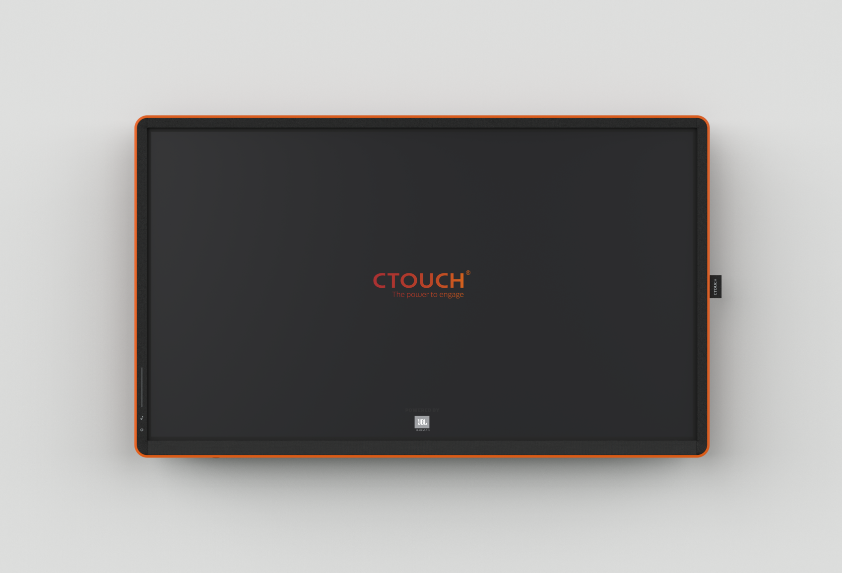
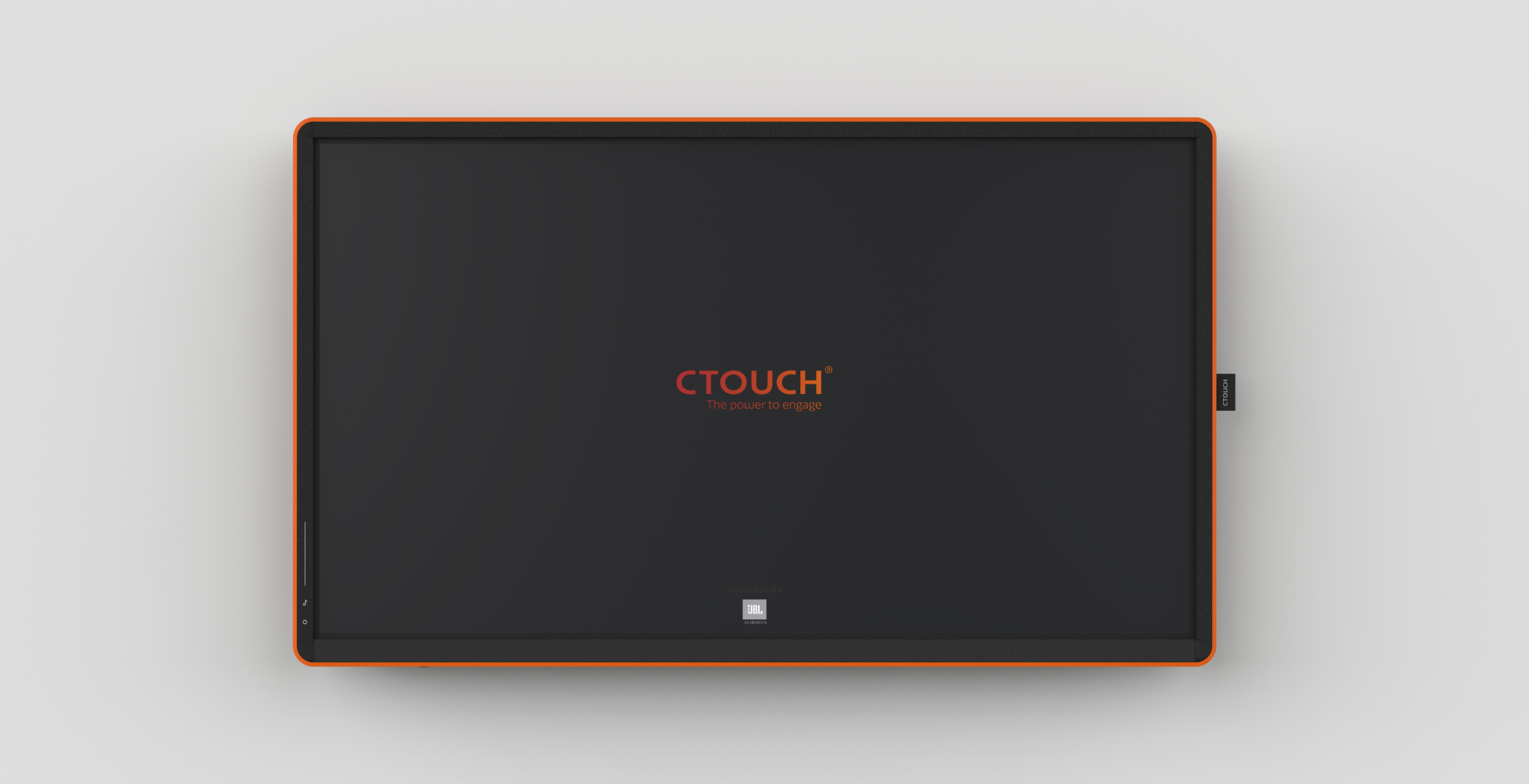
Touchable
A design system connecting interaction and physical design for large, interactive displays.
Almost all large interactive flat panel display (IFPD) are similar in shape, proportions and finish to a traditional television. Anyone who has been near, or grown up with any of these traditional flat screen televisions knows that you MUST NOT TOUCH THEM!
Because of this existing knowledge, these large interactive displays cannot be designed in the same ways as PCs, pads & smartphones. The goal of the Touchable Design System is to break through this existing mental model so that corporate users intuitively want to reach out and touch the display at work.
CLIENT: CTOUCH
AGENCY: Nupky
SCOPE
Product Designer
Industrial design
Interaction design
UX design
Innovation strategy
Design system development
Design for Manufacture
A Purple Triangle
What is the value of a large touch-screen at work? Wel, try to use words to explain this purple triangle. Each person could potentially imagine a different purple triangle.
With a quick sketch your team removes uncertainties and engages discussion around unspoken ideas, changes & agreements – which are easily shared after a meeting to encourage follow-up.
The change of environment also affords for building a ritual and capturing attention in ways that gets colleagues moving.
Interaction begins with love at first touch.
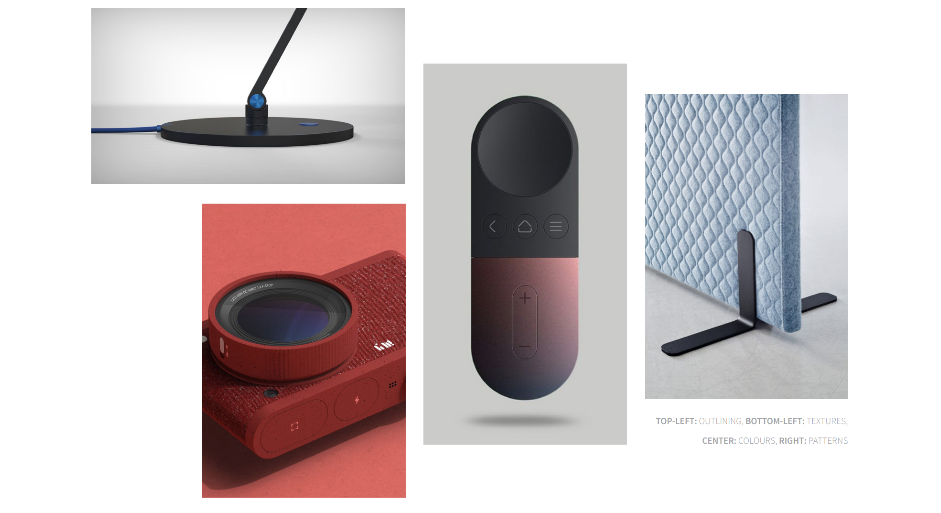
A design trend analysis showed that there were around 5 different characteristics of a design which made it to be considered touchable. These were: Geometrical patterns, Material textures, Detailing, Colours / Gradients, and not being allowed to touch.
Each of these has one of 3 materiality levels. Rugged touch is created through rougher material textures, refined touch is made from detailed material textures,
and digital touch is any visual texture communicated on the display. Each of these 3 materiality requirements also has a haptic and an optic variant; a texture you can touch and texture you can feel by seeing (associated to other touch sensations in their past).
And lastly, simple affordance indicators show possible actions, and thereby suggest to the user how they might be able to use the design correctly.
The Rules
Touchable was developed after observing modern office locations and workers, through discussions with purchasing and ICT installation stakeholders, and by exploring different design directions with the developers and architects that build up these offices.
The most important Touchable rules are:
- This is not a TV. Use colours & touchable materials to attract first touch from a distance.
- Is Touch ok? Give unique, useful and usable rewards to users for exploring through touch.
- Shared use. Beginners interact with the front of the display, experts explore the details at the back. Design accordingly.
Rule 1: This is not a TV
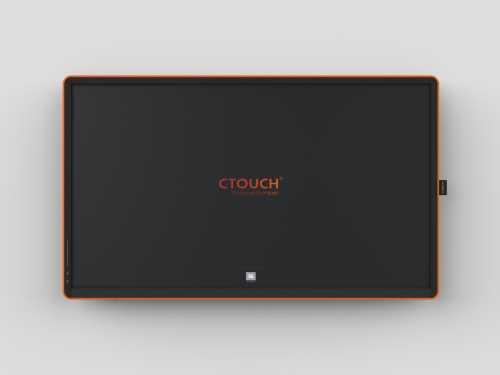
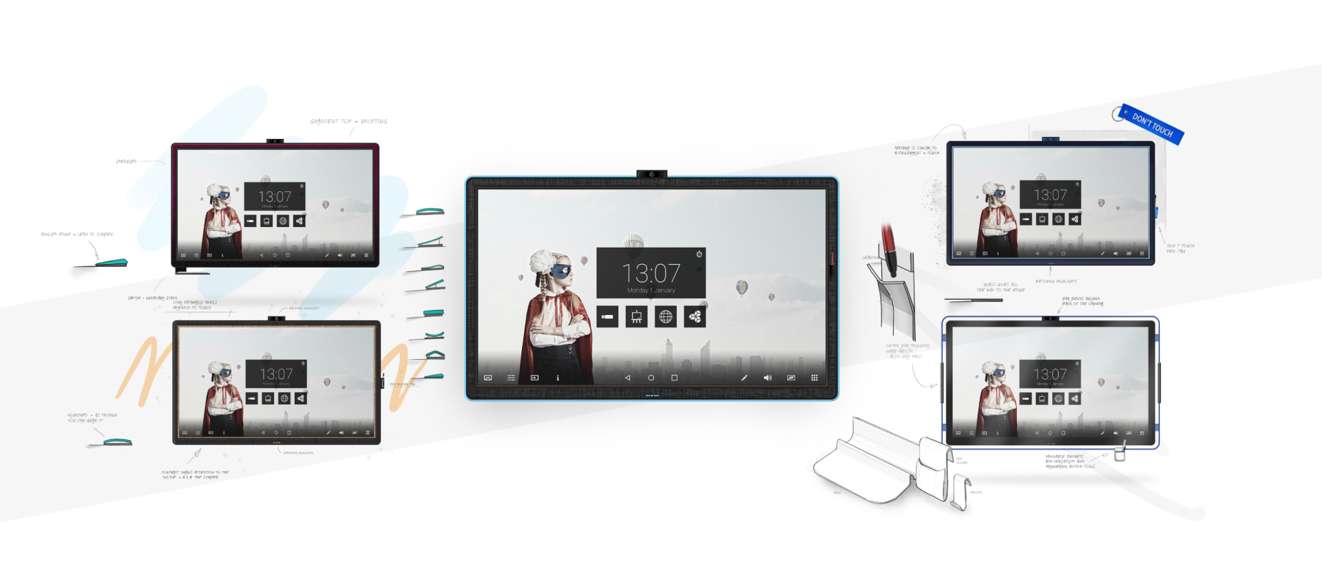
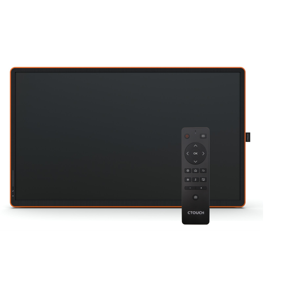
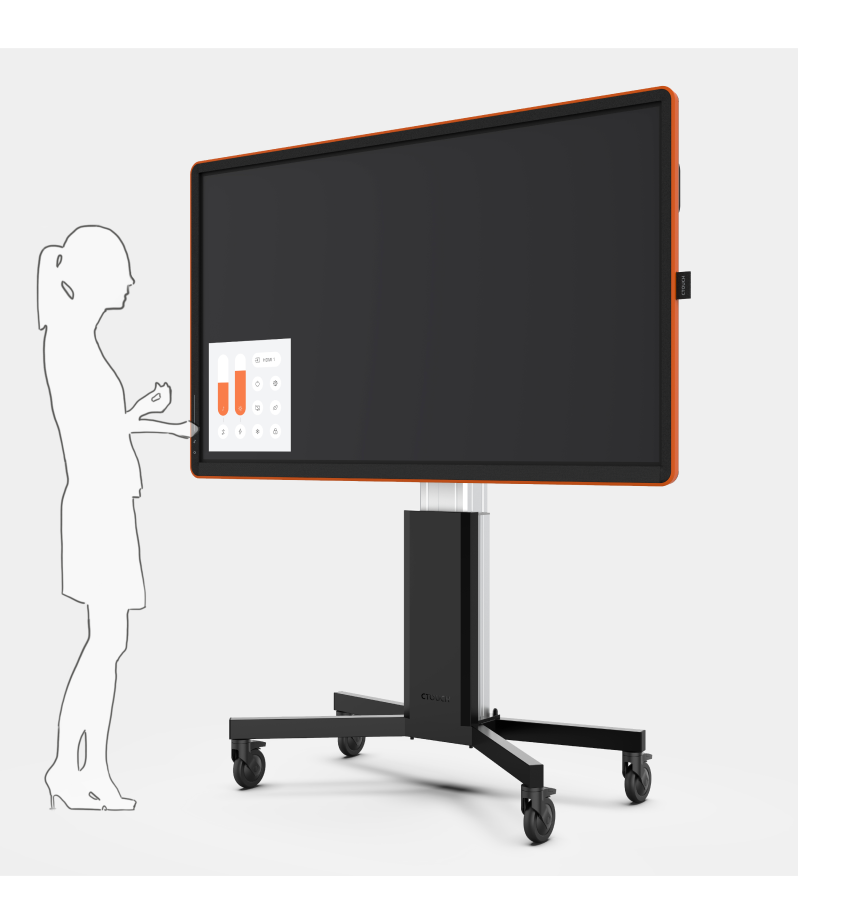
CTOUCH Canvas is the first interactive display with Touchable Design. The most noticeable element of its design is its colored rubber outer layer.
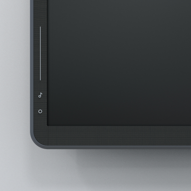
The color pulls you in from a distance, and a textile texture on the front of the screen makes you want to touch the screen edge. From here, touch-sensitive icons on the side of the screen introduce you to further touch experiences in the digital world.

Rule 2: Is Touch OK?
An important part of the Canvas design was in ensuring that everything was touchable on the front of the display. This is the point of contact for new users, and should always reward touch. This is why the remote control sensor is hidden beneath the textile upholstery. This allows for a clean, and seamless design with no special sensor windows.
Rule 3: Shared use
All the touch sensitive control elements have been placed on the left, front-facing side of the screen. This way, anyone wanting to change settings can do so without blocking the screen with their body and disrupting the collaboration of other people at that moment.
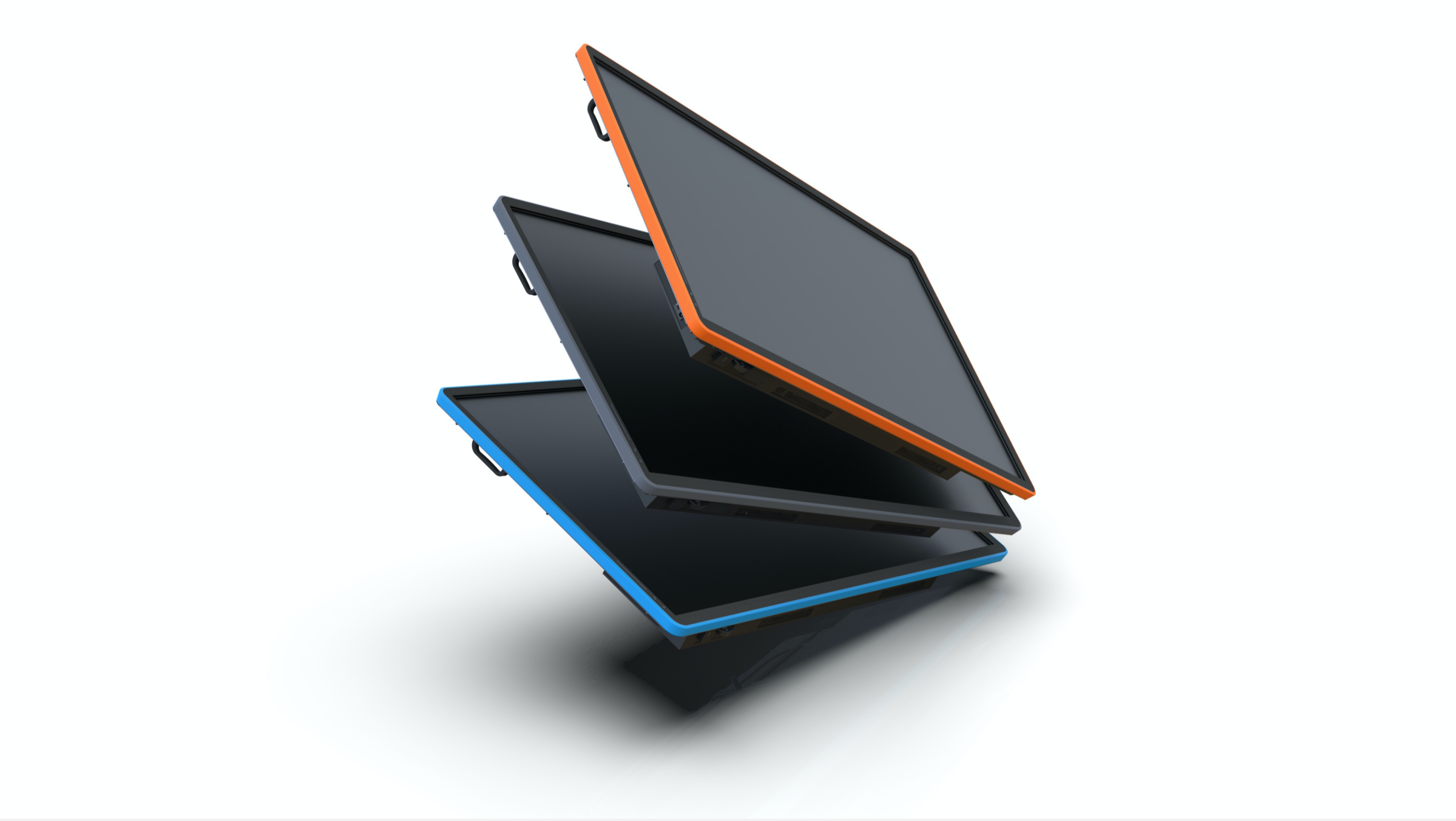
Colors of Collaboration
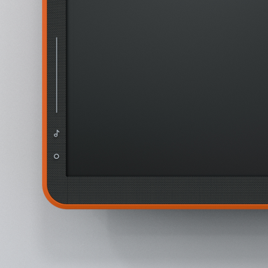
Regal Orange
Orange is known to trigger conversation and excitement, whilst activating your brain. Orange is used in active meetings like brainstorms, workshops & pitches.
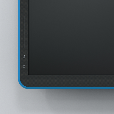
Electric Blue
Blue communicates confidence, imagination, inspiration, and intelligence. Blue is used in reflective meetings like retrospectives & planning.
Midnight Grey
Midnight grey is a timeless color that lends from the strength & mystery of black. It is formal, balanced and sophisticated. Grey is used in formal meetings like board meetings & escalations.
The Writer
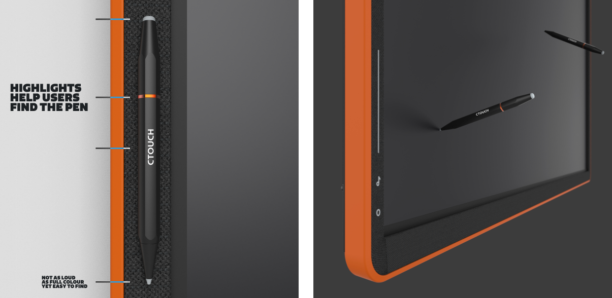
The Canvas Writer enables you to write more accurately than your finger is capable of and has two tips that allow for thick & thin pen use. It has a larger, more solid metal body than it’s predecessor which serves to improve
handwriting. It also adds a corporate premium feel, combined with in-hand comfort. Lastly, It magnetically clicks onto the front of the display for easy access & uses an orange ring to keep it visible against the textile.
The Stage
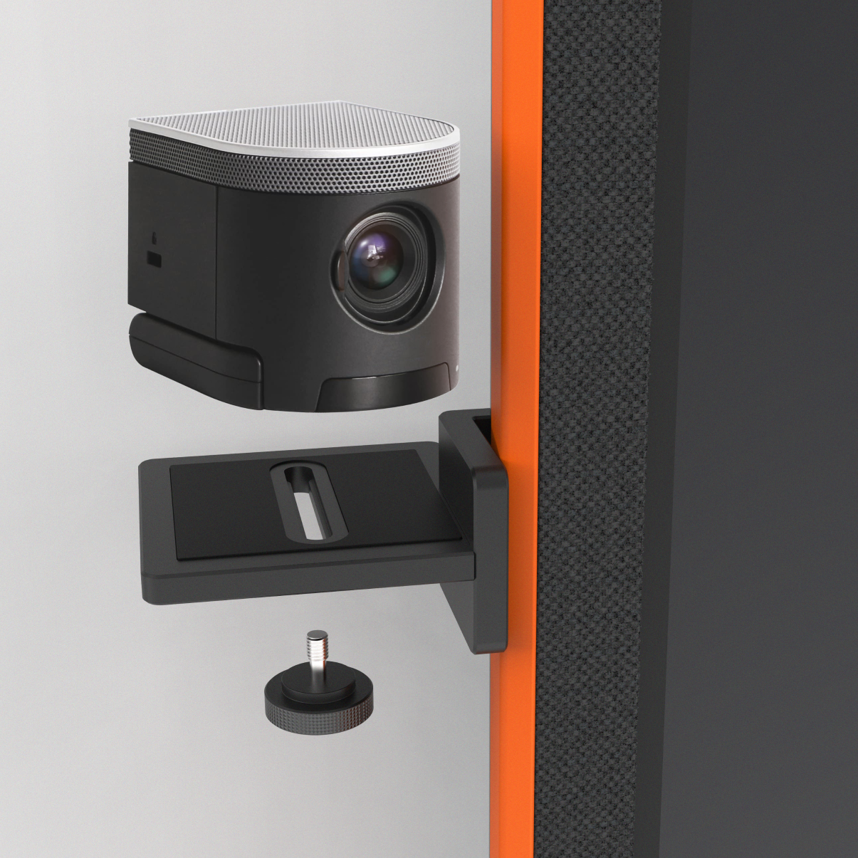
One of the main challenges of video calls with large displays is that you look down on people from the top of a display.
The Webcam Stage magnetically snaps onto either side of the display, at any height, to allow for a more personal meeting experience. One where you look at each other from eye-level.
